Porter Design System
Building the foundation that let Porter's teams stop guessing and start shipping.
Team
Skills / Tools
Figma
Storybook
Chromatic
Supernova
Reviewing code
Usability testing
Timeline
Sept '24 - Nov '25
STATUS
No design system meant maintenance, not growth
1
Lack of a clear source of truth made building UIs a guessing game, creating design and technical debt.
2
Ungoverned components turned the Asset Panel into a search task instead of a pick-and-place tool.
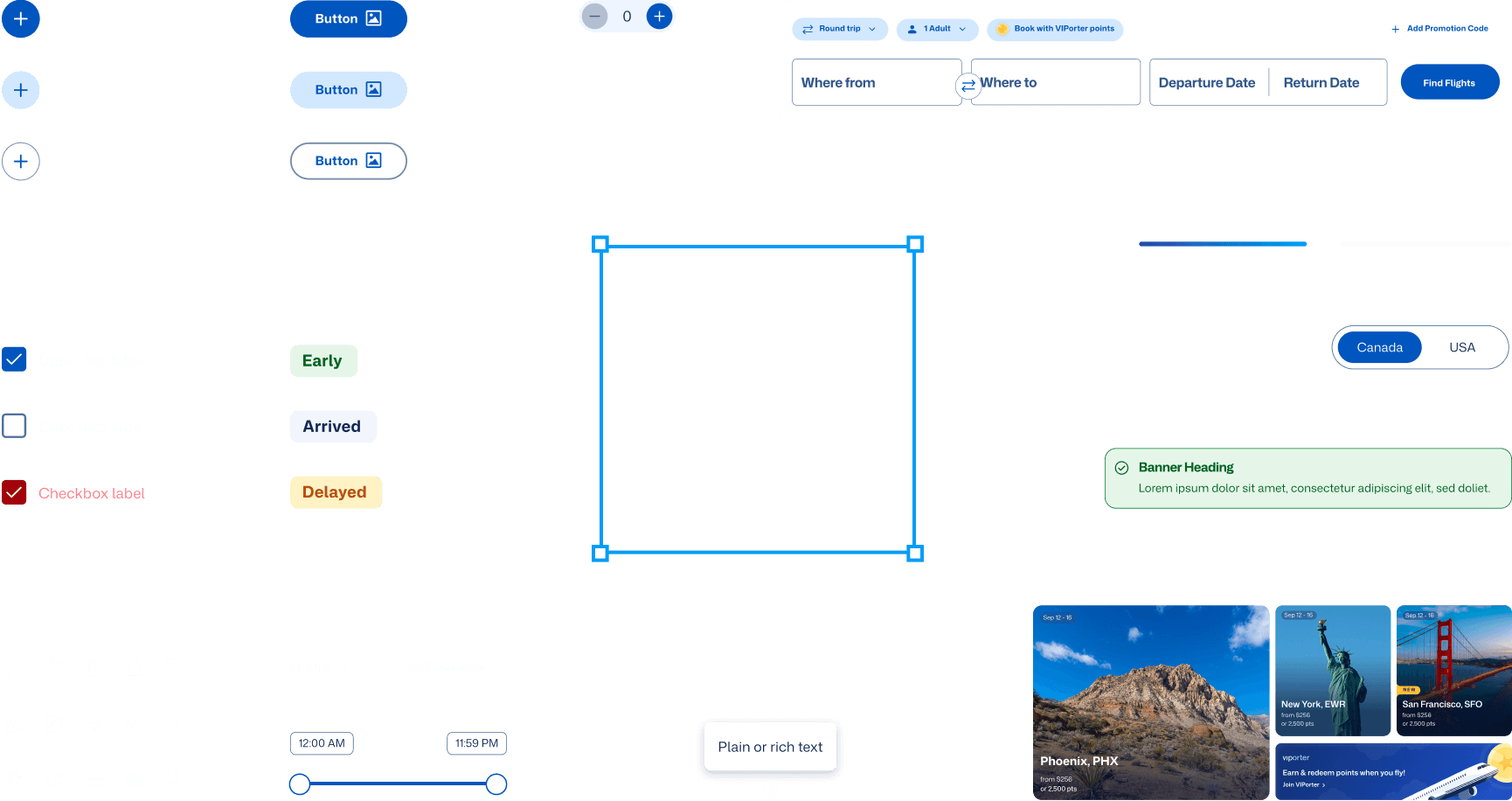
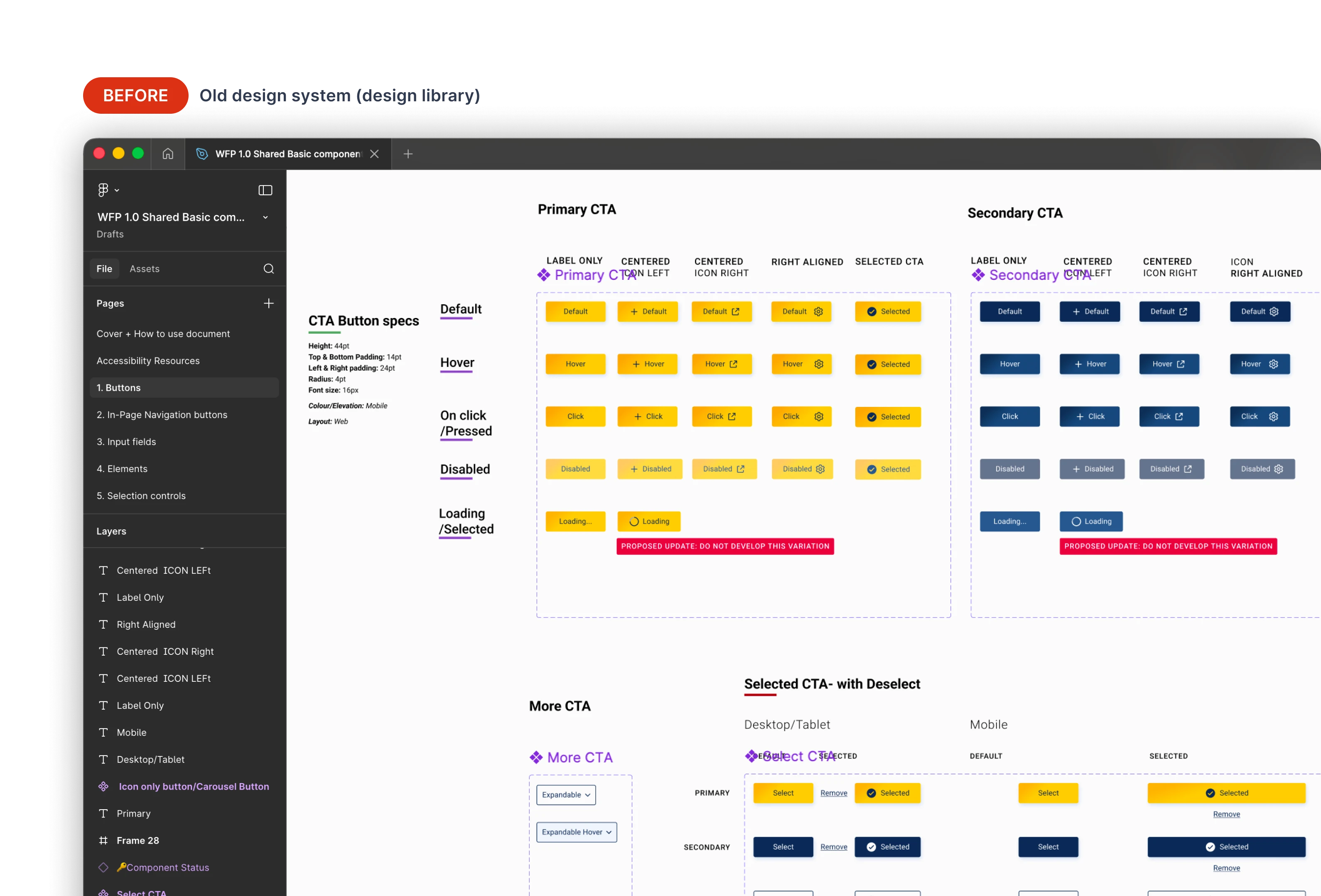
33 components, one library
I audited Porter's critical flows and built 33 core components, from universal UI like buttons and comboboxes to Porter-specific patterns like airport codes and the flight tracking bar. Consolidated from 24 fragmented libraries into one. Spacing, color, and typography tokenized throughout.
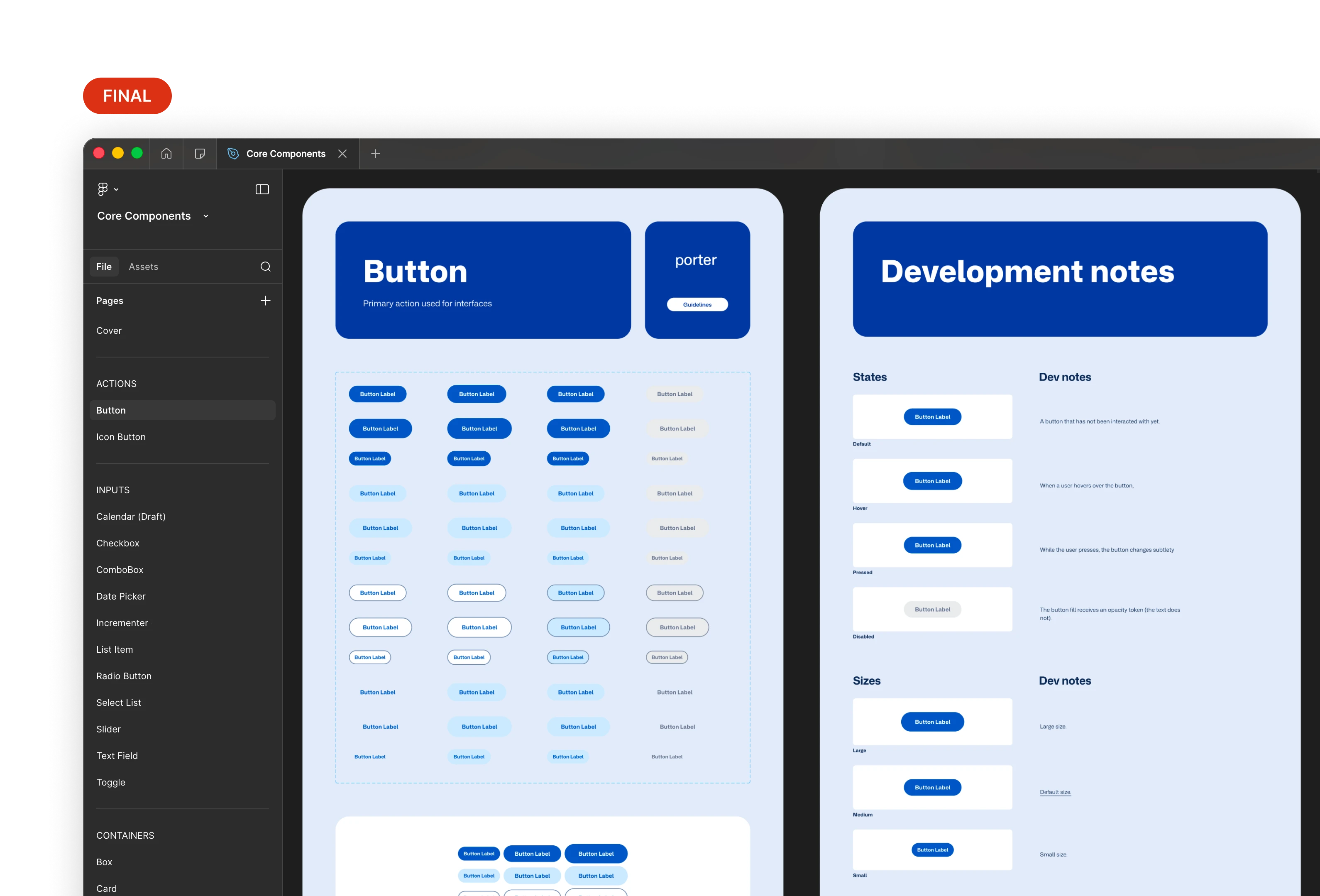
One place to find everything.
One source of truth for design, code, and craft decisions
I co-led usage guidelines with the product owner, accessibility lead, and content designer. Every component shipped with documented intent, interaction states, accessibility notes, and implementation guidance for developers.
Microinteractions took the most iteration. Each one had to feel right, pass WCAG 2.2, and work as a repeatable pattern across components. We went through several rounds as the library grew, pressure-testing early decisions against new edge cases we uncovered.
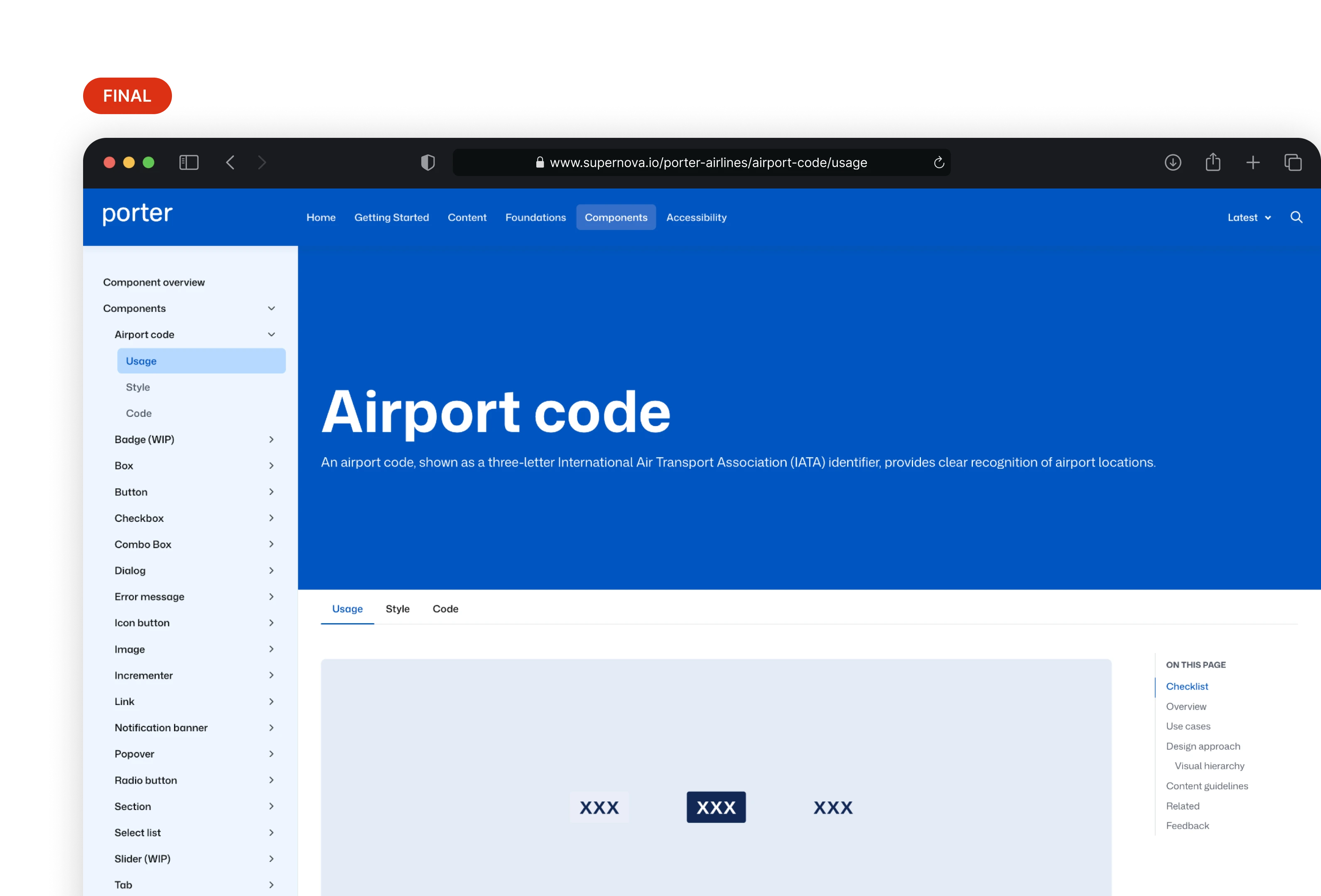
Component documentation in Supernova. Design decisions don't get lost in handoff.
Built adoption into the process
I mentored five designers 1:1 to build familiarity with the system and surface gaps. I recorded short release demo videos so updates were easy to absorb. While training Victoria, I ran a screen replication challenge with Victoria, with the system, she finished 20% faster than without it.
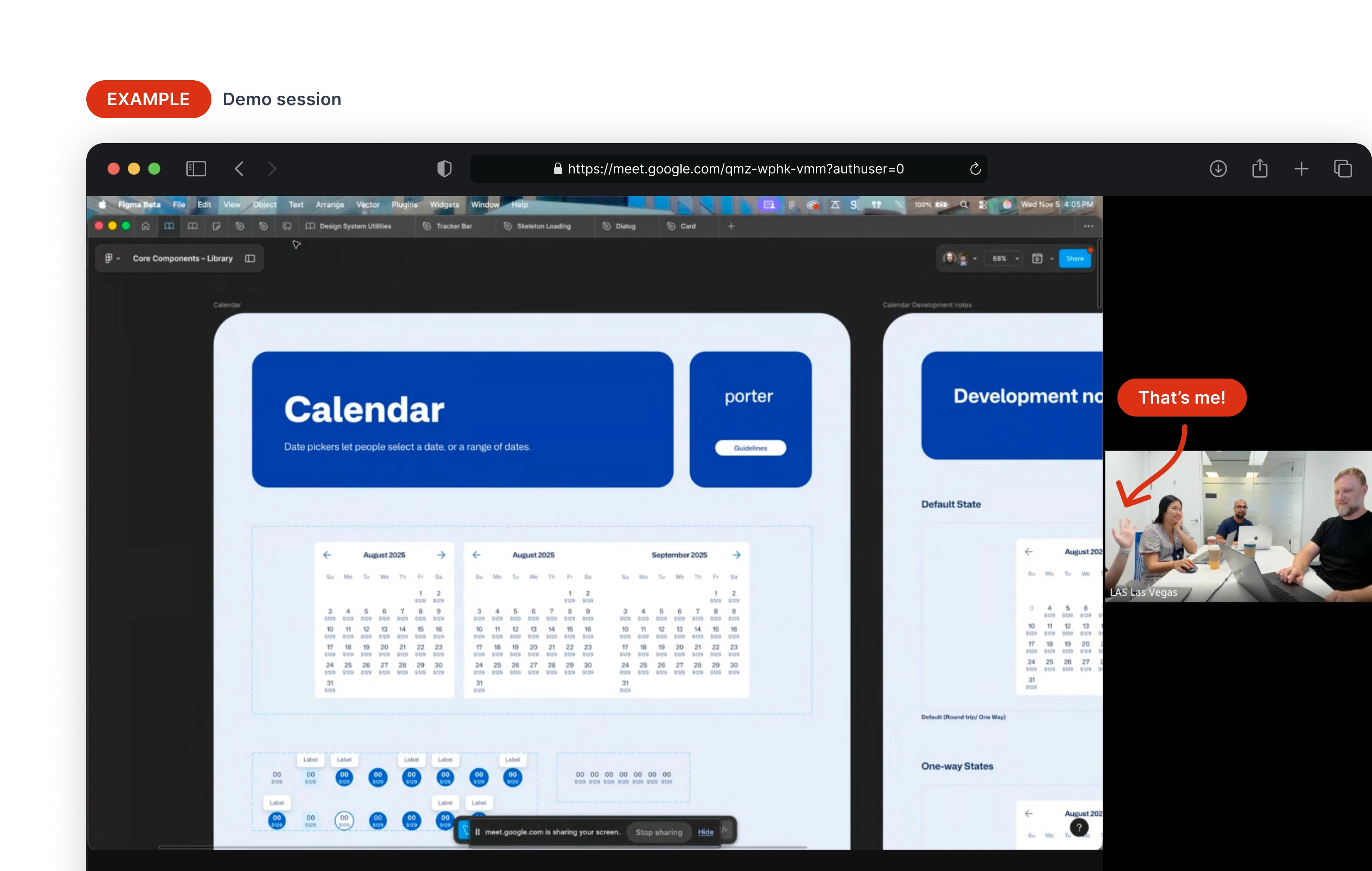
Our demos were short, scannable, and fun.
All 33 released components passed WCAG 2.2 testing. The accessibility lead ran the final audit; I participated in every session and shipped fixes as issues came up.
Victoria replicated a Flight Status screen 20% faster using the design system than without it. Small sample, but early signal.
Book a Flight, the first full flow built with the system, took roughly two hours to design with the DS. The same work had previously taken several weeks.
Dev time delta wasn't measured before the project ended. Time-to-implement for a common set of components, before and after adoption, is the metric I'd capture next.
Three things I'd add with more time: Figma MCP for generating system-compliant UI from prompts, Supernova for early vibe-coded prototypes, and explicit motion guidelines.