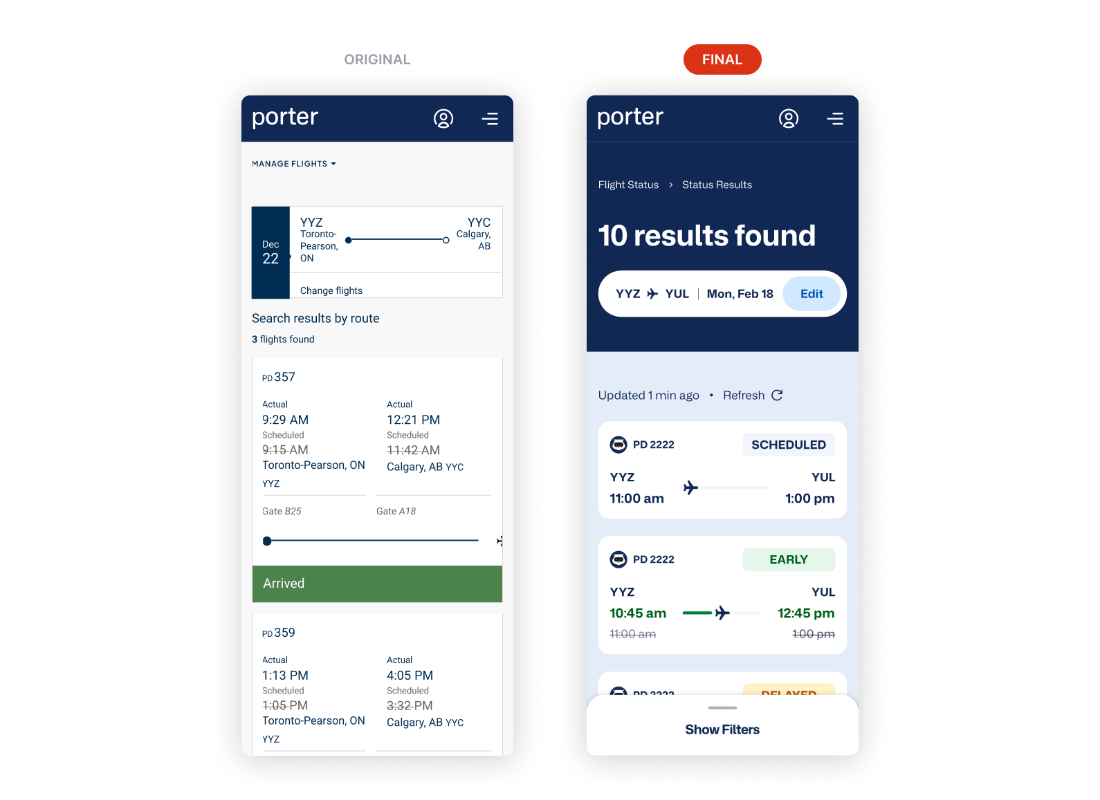
Porter's second most popular flow had a clarity problem
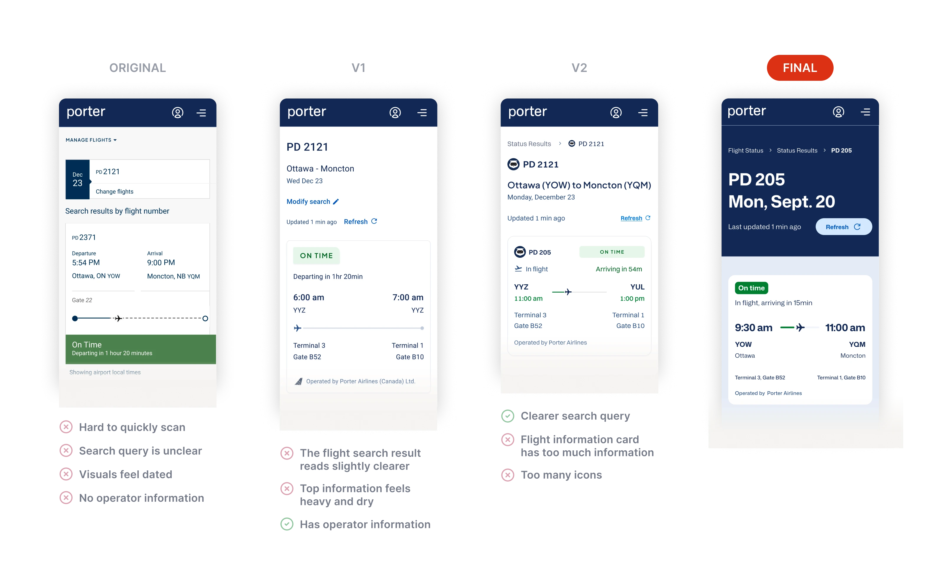
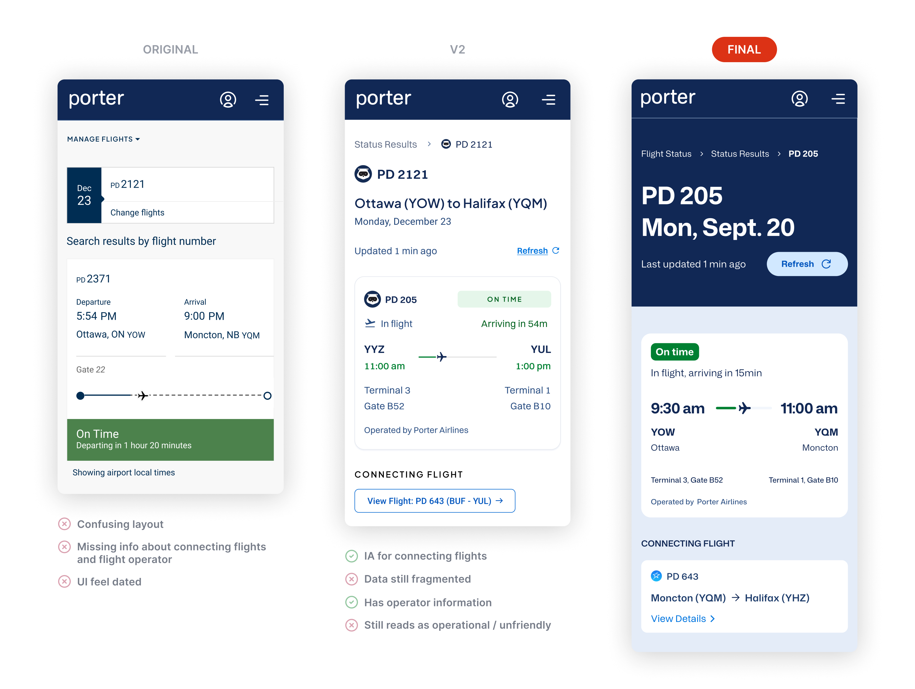
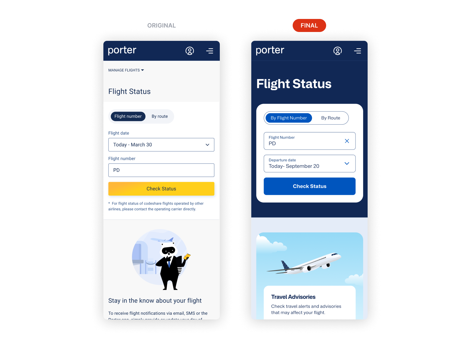
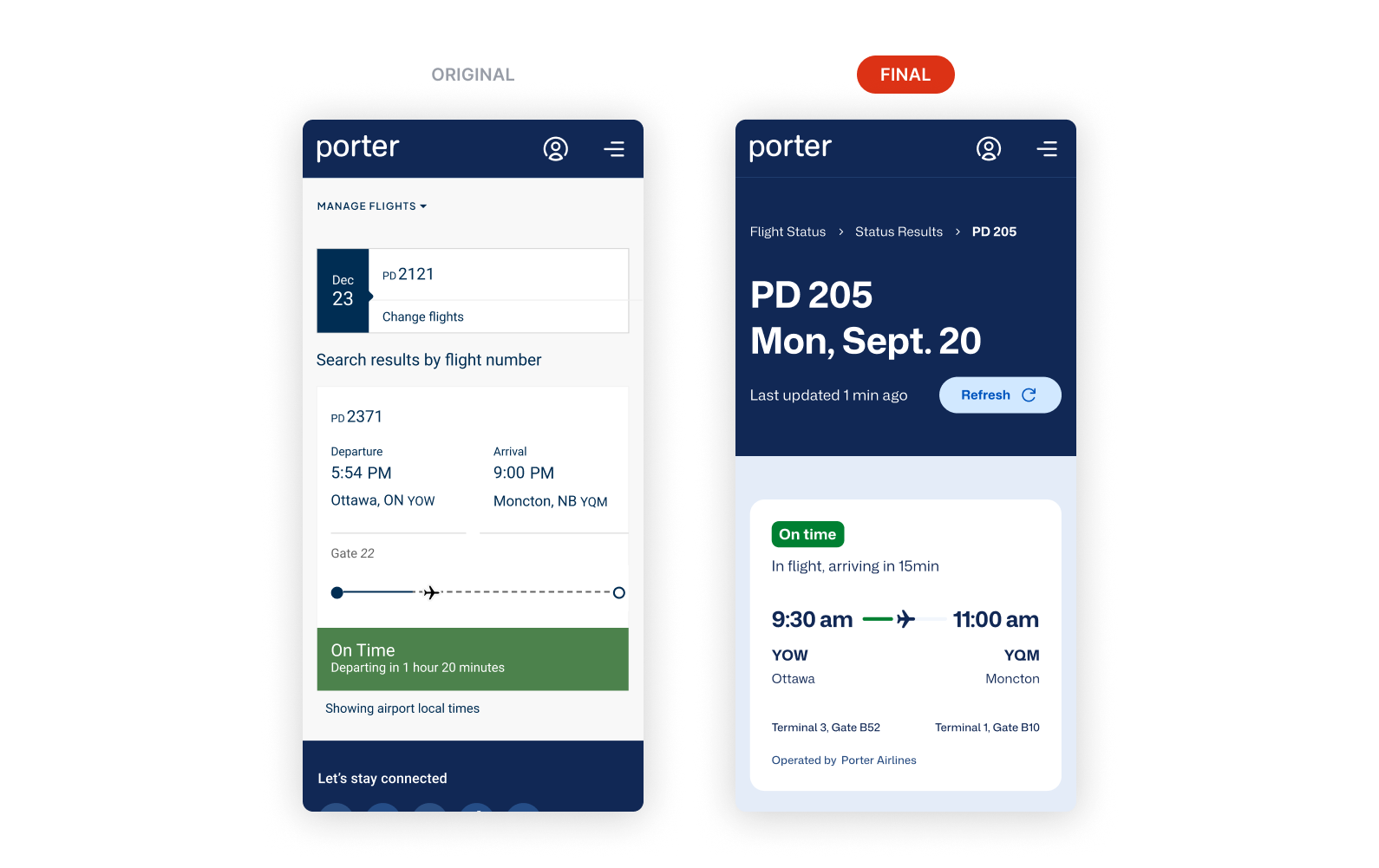
Flight Status gets 1.25 million visits a month at Porter, second only to booking. The page wasn't designed for travel: for the stressed, in-motion moments passengers open it. In interviews, gate agents flagged that passengers struggled with the page in those moments. Passengers came for one answer, and the old layout made them hunt for it while ignoring operational states like diverted flights. I redesigned it for clarity and coverage, built on the design system I developed in parallel, and validated the result with users.
1
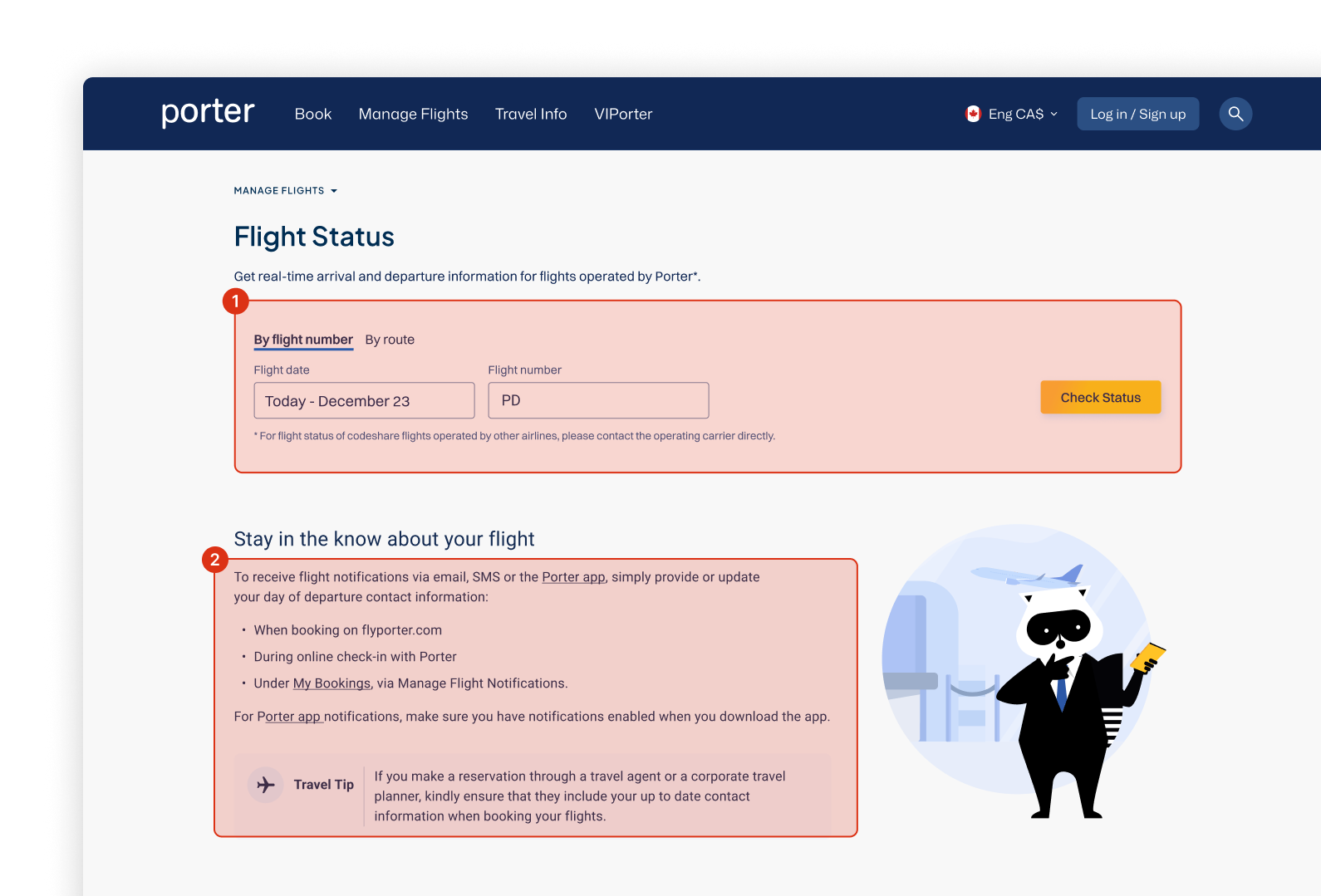
Poor grouping between key actions harms usability, making scalability difficult and goes against Fitt's Law.
2
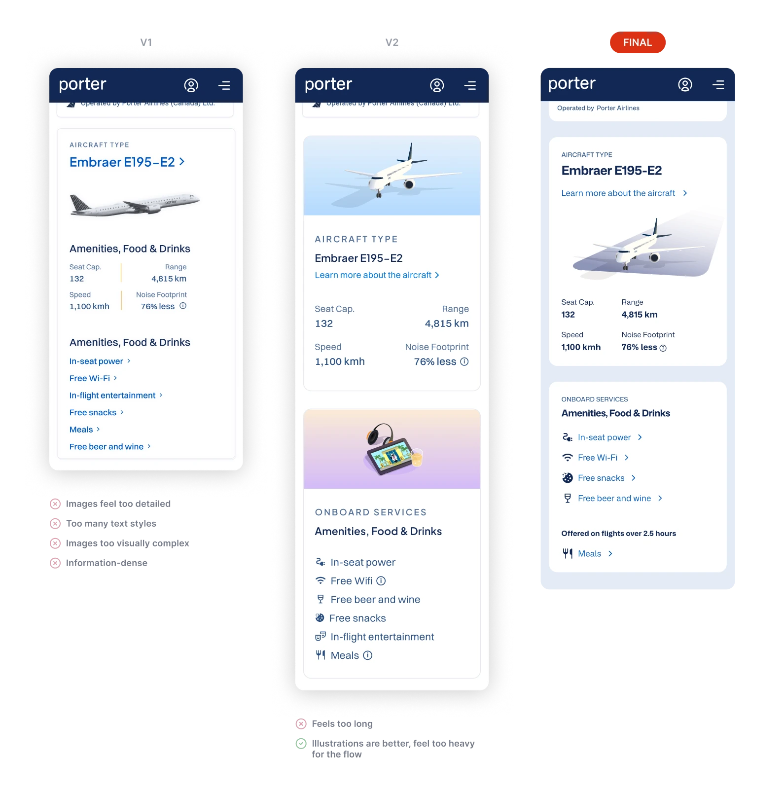
Secondary information clutters the page, shifting the user's focus away from what they came for.
3
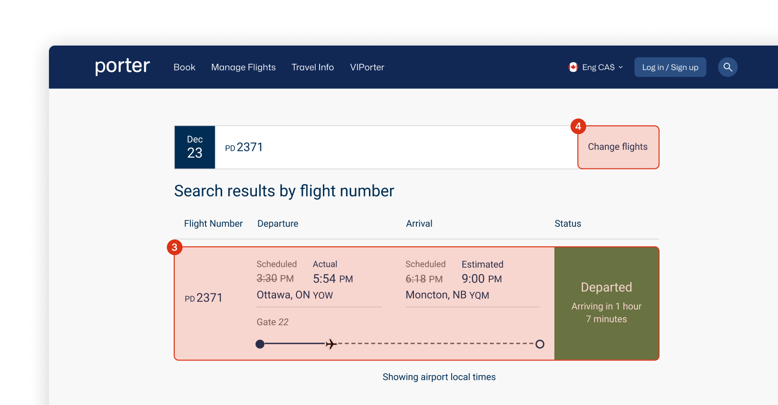
Competing system states and dated layouts fail to quickly tell the user a story about what's happening with their flight.
4
Ineffective architecture made users have to manually search for their connecting flights.