Porter Design System component library

Porter Design System

Building the foundation that let Porter's teams stop guessing and start shipping.

Go to results

No design system meant maintenance, not growth

Porter wanted to scale its digital product, but had no shared system for designing or building UI. Designers worked across 24 separate Figma libraries. Developers hand-coded repeated components from scratch. Inconsistencies accumulated into debt. Effort went into maintenance instead of new work.

Porter Design System overview
1 Lack of a clear source of truth made building UIs a guessing game, creating design and technical debt.
2 Ungoverned components turned the Asset Panel into a search task instead of a pick-and-place tool.

33 components, one library

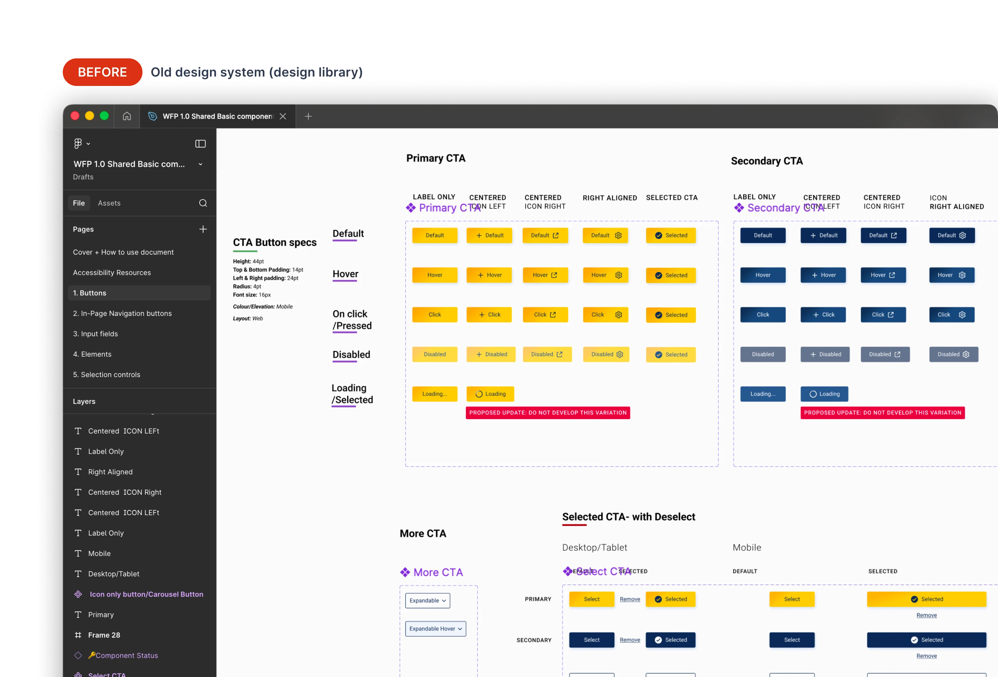
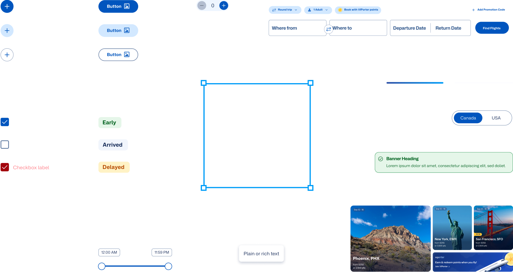
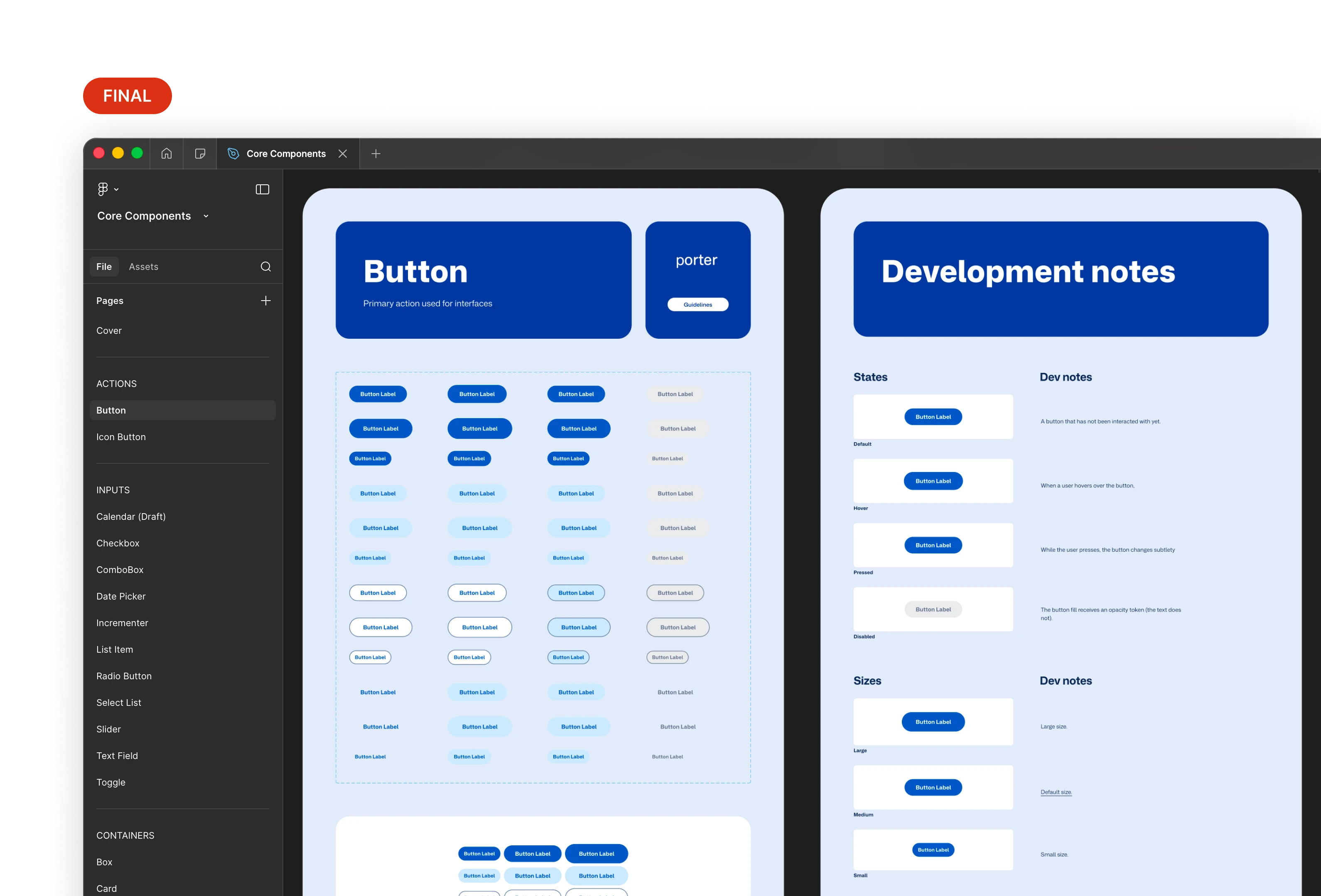
I audited Porter's critical flows and built 33 core components, from universal UI like buttons and comboboxes to Porter-specific patterns like airport codes and the flight tracking bar. Consolidated from 24 fragmented libraries into one. Spacing, color, and typography tokenized throughout.

Component library showing all 33 components organized in Figma

One place to find everything.

One source of truth for design, code, and craft decisions

I co-led writing usage guidelines with the product owner, accessibility lead, and content designer. Every component shipped with documented intent, interaction states, accessibility notes, and implementation guidance for developers.

Microinteractions took the most iteration. Each one had to feel right to stakeholders, pass WCAG 2.2, and work as a repeatable pattern across components. We went through several rounds as the library grew, pressure-testing early decisions against new edge cases we uncovered.

Supernova documentation showing component intent, states, and accessibility notes

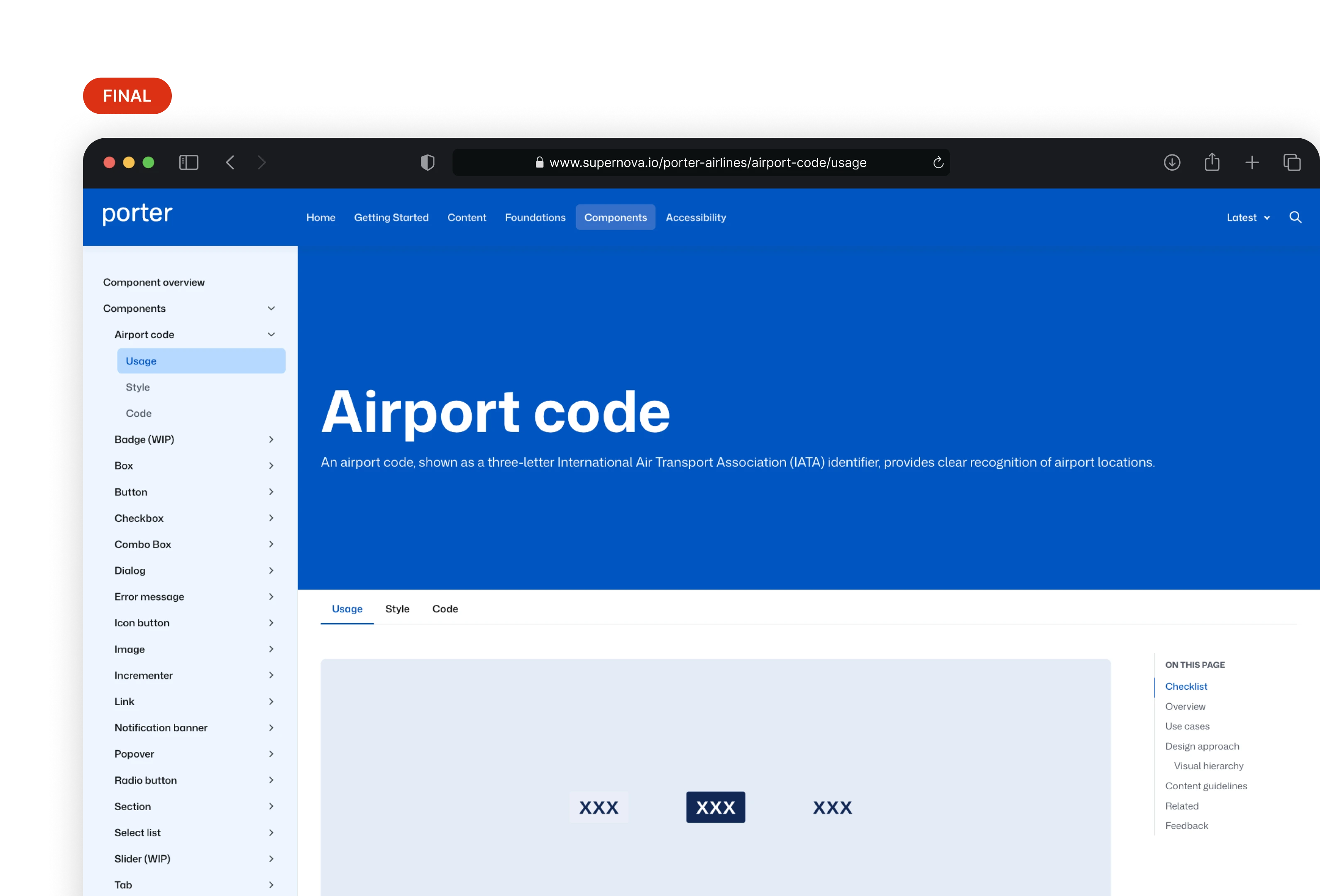
Component documentation in Supernova. Design decisions don't get lost in handoff.

Built adoption into the process

I mentored five designers 1:1 to build familiarity with the system and surface gaps. I recorded short release demo videos so updates were easy to absorb. While training Victoria, I ran a screen replication challenge with Victoria, with the system, she finished 20% faster than without it.

Demo video thumbnails from release updates — short, scannable, and fun

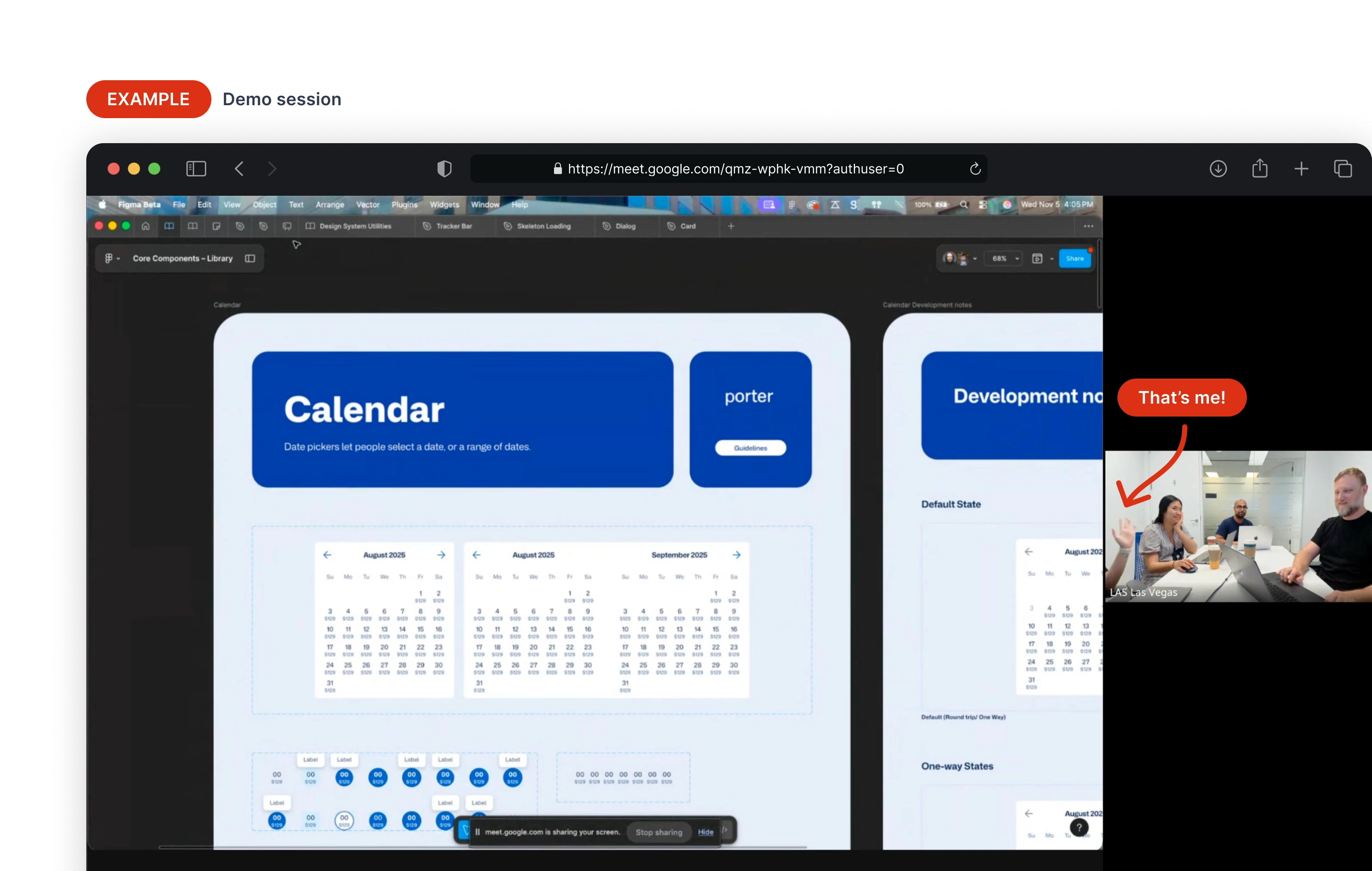
Our demos were short, scannable, and fun.

Results
33 components passed WCAG 2.2. The accessibility lead ran the final audit. I shipped fixes as issues came up across every session.
Designs produced 20% faster. Victoria built a Flight Status screen using the system and without it, as a head-to-head test. Small sample, but early signal.
Book a Flight took two hours to design with the system. The same work had taken several weeks before.
What I'd do differently
Build benchmarks into the system rollout. Engineers were no longer hand-coding components, so the dev-side gain was self-evident. I deferred quantifying it under time constraints and leaned on one Victoria comparison for design-side signal. Measuring time-to-design, time-to-implement, and adoption rate would have hardened those qualitative signals into more defensible data over time.
What's next
Figma MCP integration. Generating system-compliant UI from natural language prompts would close the gap between ideation and production-ready components, accelerating delivery further.
Explicit motion guidelines. Motion was consistent across components, but documented guidelines and tokens would maintain that consistency as the system grows.